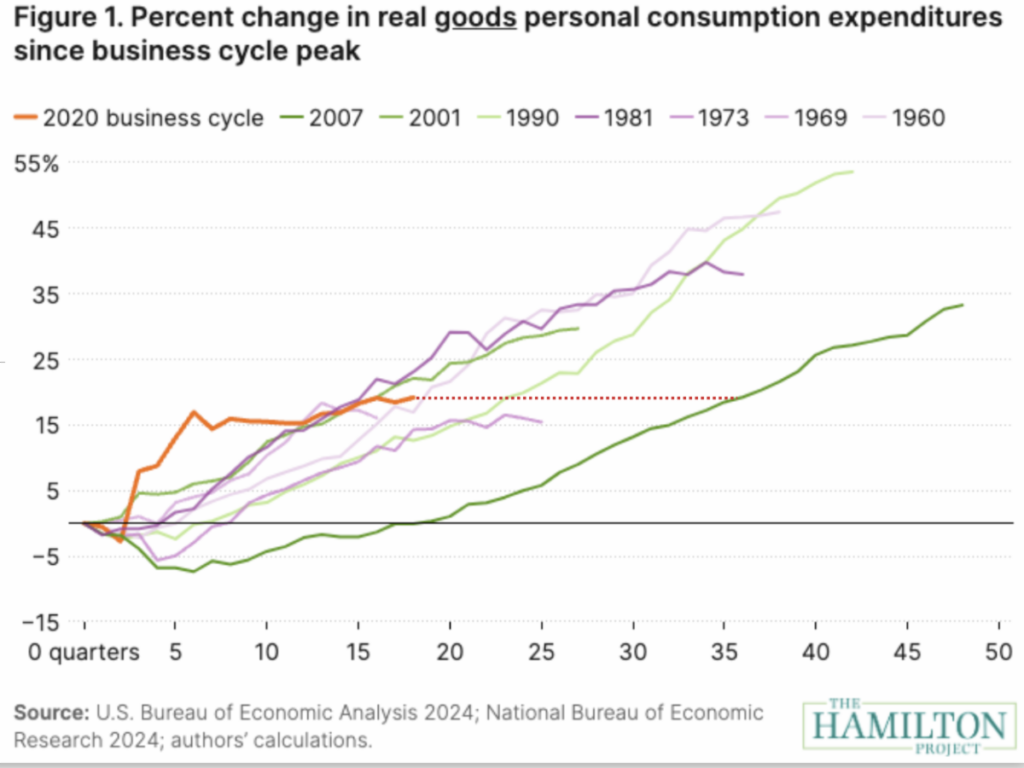
The Brookings Institution’s Hamilton Project has just published a set of nine interactive charts showing how household finances in the current business cycle compare with past ones. Above you’ll find one of them, tracking changes in real (i.e. inflation-adjusted) personal consumption expenditures for goods over eight different business cycles since 1960. The bright orange line shows the current, COVID-induced cycle, while the dark green line marks what happened during the Great Recession starting in 2007.
The chart shows three noteworthy things about the current cycle. First, spending on goods shot up faster and earlier than any other economic cycle over the past 60 years. Second, spending growth has now stalled and is beginning to put the current cycle closer to the historical norm. Third–and this is the reason for the dotted line–it has taken only 15 quarters to achieve 19% growth in real goods spending this cycle. We needed 36 quarters during the Great Recession to do the same.
Other charts show that real compensation has held up relatively well this business cycle, but real disposable personal income has been relatively weak. And household net worth has grown more than just about any other cycle, thanks largely to equity in real estate.

